Kaplan-Meier Survival Curve Explained (with Example)
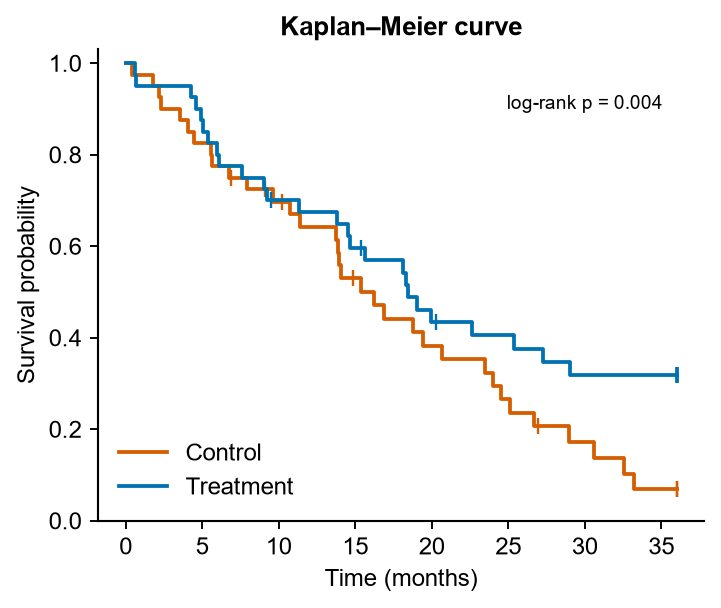
A Kaplan-Meier curve shows the proportion of patients (or animals) who have not yet had an event, such as death or relapse, over time. It is the standard figure for survival data.
How to read it
- Each drop is one or more events at that time.
- Tick marks are censored subjects: they left the study or the study ended before they had an event. They count until that time but not after.
- Median survival is the time where the curve crosses 0.5.
Data you need
One row per subject with three columns: group, time to event or last follow-up, and status (1 = event, 0 = censored).
Comparing groups
The log-rank test checks whether the curves differ. Report its p-value on the plot. For effect size, a Cox model gives a hazard ratio with a confidence interval.
Making a clean figure
- Use a step line for each group, with censoring ticks.
- Add a number-at-risk table below the x-axis if your journal expects it.
- Start the y-axis at 0 and end it at 1 (or 0–100%).
Make one from your CSV with the Kaplan-Meier Curve tool.
Make your figure nowDescribe it or upload a sketch. Free to start.
Open SciFigures
More guides
- How to Make a Graphical Abstract (Step by Step)
- Journal Figure Requirements: Size, DPI and File Formats
- How to Make Good Scientific Figures for Your Thesis
- Colour-Blind Friendly Colour Palettes for Scientific Figures
- How to Draw a Mechanism of Action Diagram
- How to Edit SVG Figures in PowerPoint, Illustrator and Inkscape
- Free BioRender Alternatives for Scientific Figures
- How to Fix AI-Generated Scientific Images Before Using Them
- How to Make a Volcano Plot (and Read One)
- How to Calculate IC50 from a Dose-Response Curve
- Drug Release Kinetics Models: Zero Order, First Order, Higuchi, Korsmeyer-Peppas
- How to Make a Forest Plot for a Meta-Analysis
- SD vs SEM Error Bars: Which Should You Use?
- How to Draw a Research Methodology Flowchart
- Figures for a B.Pharm or M.Pharm Project and Thesis
Popular tools
Graphical Abstract MakerTurn your paper's story into one clear visual summary for the journal submission system.Scientific Figure MakerMake clean, publication-quality figures for papers, theses and posters from a sketch or a sentence.Scientific Illustration MakerDraw polished scientific illustrations in a clean BioRender-like, journal or textbook style.Scientific Poster Figure MakerMake big, readable infographic panels for conference and research posters.Conceptual Framework Diagram MakerShow variables, relationships and hypotheses of your study in one tidy diagram.Biological Pathway Diagram GeneratorDraw metabolic and biological pathways with correct steps, enzymes and arrow directions.